Trading Competition
UI Modularization
Futures Grand Tournaments are bi-yearly trading competitions for futures users to show off their trading skills and win a prize pool of up to 1,800,000 USDT. It originally started in 2020 and has been held every year ever since. Since it became a regular event, I developed UI modules to increase the speed of design and development, along with another UI/UX designer.
Project
UI Design
Role
UI Designer in a team of 3
Time
2022
Background & Problem Statement
At our post-tournament retrospective, both designers and engineers agreed that we were very pressed on time and there was a need to modularize aspects of the competition going forward, yet simultaneously allow a high degree of customization as each competition’s visual identity and tournament mechanisms would be different. This would speed up design efficiency and reduce the development effort made for a short-term event.
My role in this project was primarily to map out the modules for development, and work with another UI designer to create and define each module’s UI specs for web, tablet and mobile (both on H5 and mini app).
Design Process
-
UI modules were defined based on frequency of use. Items, such as bonus pool, that were more likely to be reused in the next competition would be developed as a module, while modules requiring heavy UI customization would allow for image embedding.
-
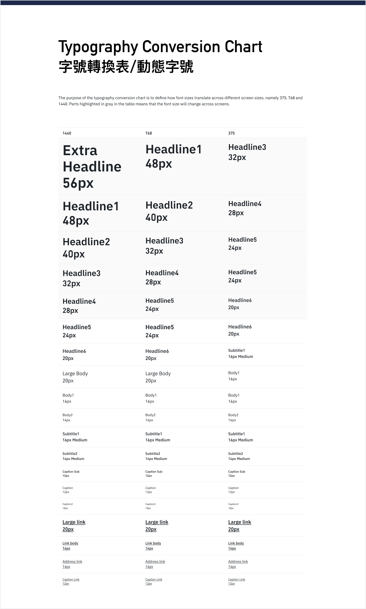
Defined UI specs for padding, font size conversion across different screens (mobile, tablet, mobile), etc. All designs would adhere to these specs going forward.
-
The UI modules were split into 2 sprints and 2 front-end engineers implemented them on code.
-
We cross-checked the design and implementation to verify that the modules were correctly implemented, and would support image embedding.
18 UI Modules for Trading Competitions
-
Key Visual Guidelines
Guidelines for each tournament’s key visual (hero image), including dimensions across different device breakpoints, file size, title
-
Entry Point Icons
Guidelines on dimensions, font, vertical & horizontal padding for the Futures Tournament icons on Binance Homepage, Futures trading page
-
Bonus Pool
Bonus Pool is a key feature - the more participants, the greater the bonus pool. Defined variable aspects (eg number of columns, font size, color, etc) and made a template
-
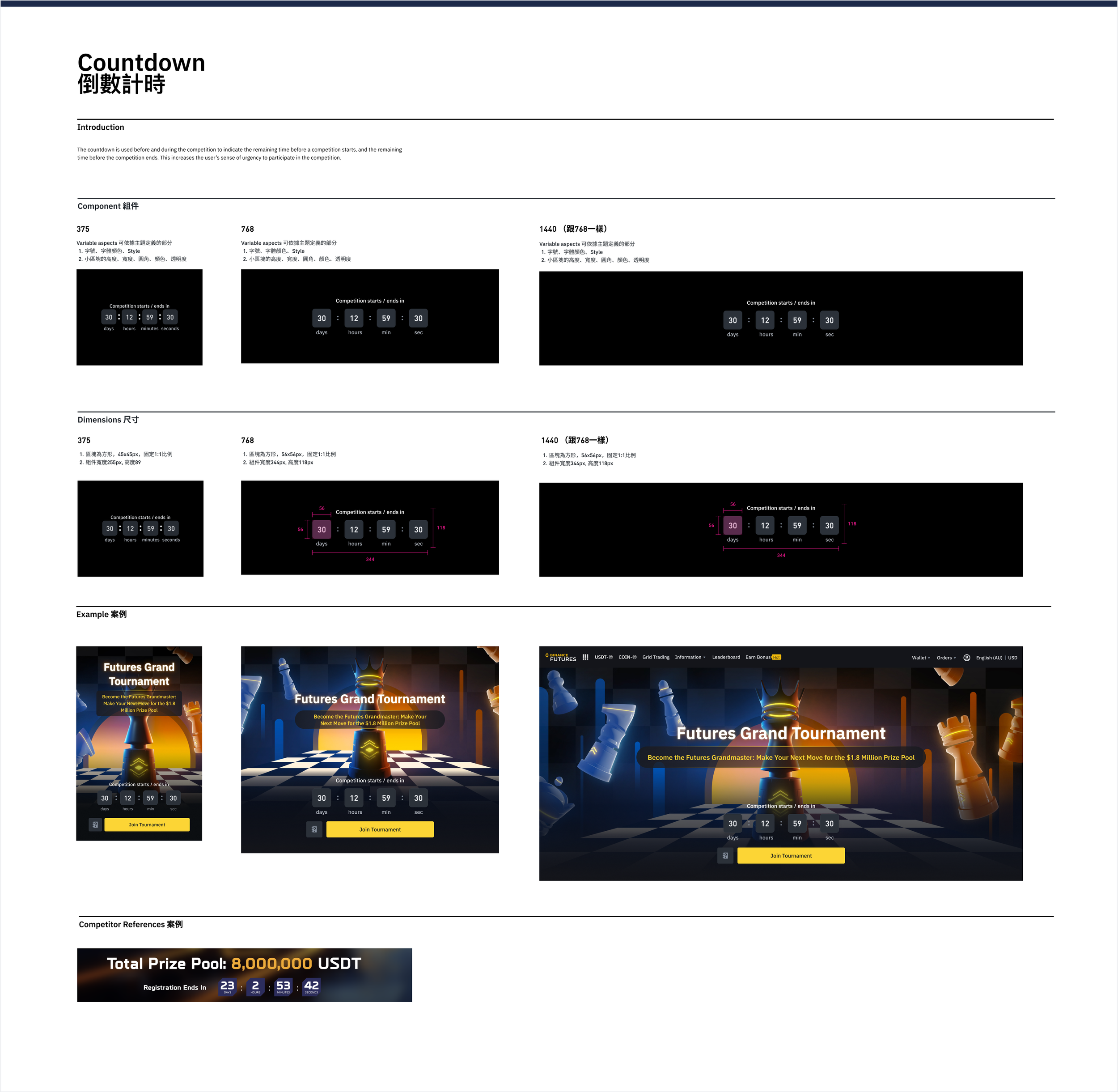
Countdown Timer
Countdown timers are used to build anticipation for the tournament’s start, and to indicate time until the end. UI guidelines and modules for different screen sizes were made
-
Competition Timeline
The timeline displays the 3 parts of each tournament: Referral Challenge, Team/Individual/Broker Competitions, and the Final Results. UI guidelines include vertical/horizontal padding, configurable backgrounds for diff. sizes
-
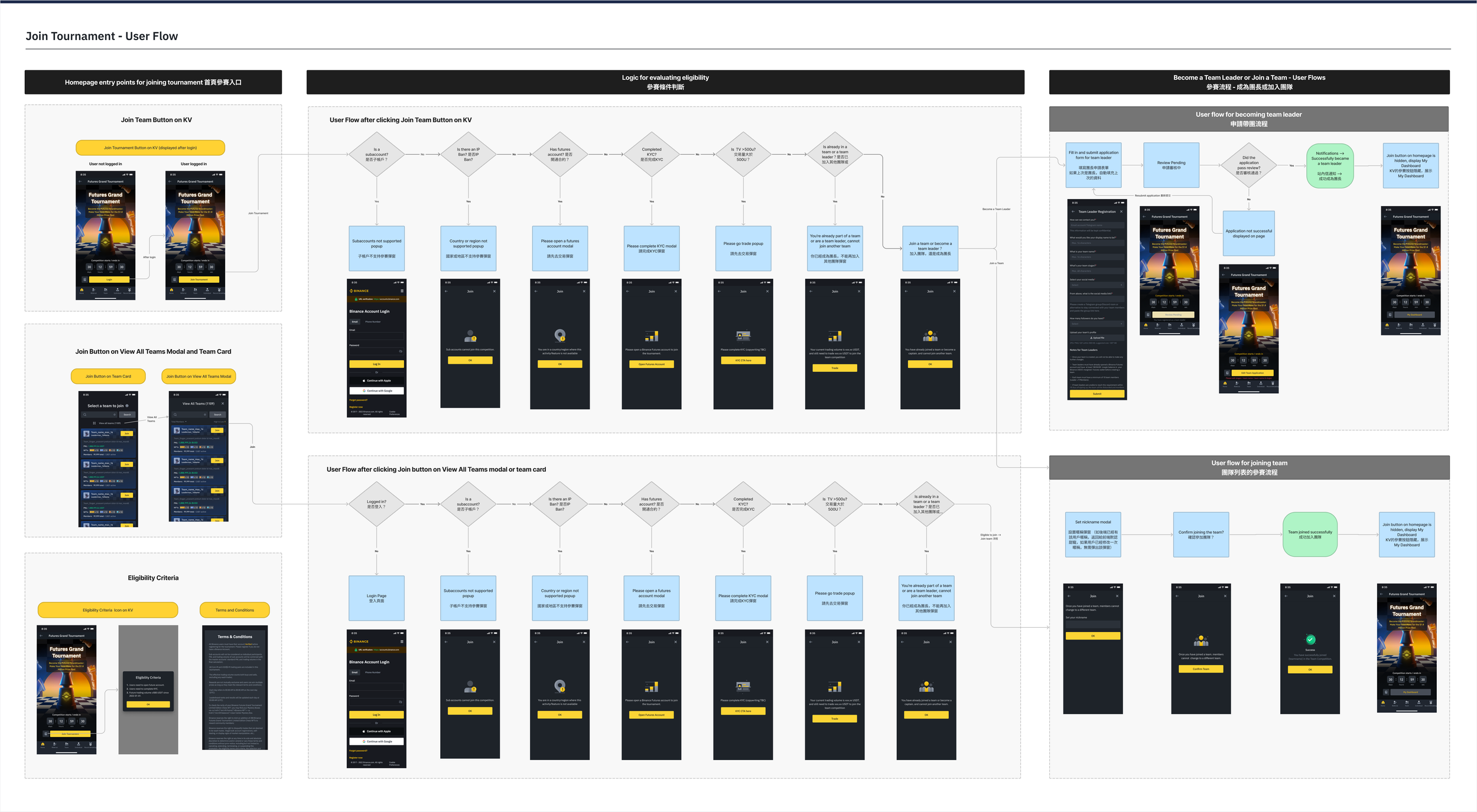
Join Tournament UX & UI
Joining the tournament is arguably one of the most important user flows in the competition. I standardized the UI and improved the UX of this flow,
-
NFTs
NFTs are used as a primary incentive during the Referral Challenge - users can use them as profit multipliers depending on the NFT’s rarity. Defined NFT image sizes, tags for SSR, SR, R and N, configurable image areas
-
Share
The Share function is used to invite new users to the competition. Defined the image size of Share graphic, sharing channels, horizontal/vertical padding
-
Lucky Draw
The Lucky Draw allows qualifying users to win cryptocurrency or trading fee rebate vouchers. Defined layout template and vertical/horizontal padding across different sizes.
-
Token of the Day
Users trading the Token of the Day get an additional profit multiplier. We produced all the graphics for the tokens and made a template for this module.
-
Broker Logo Guidelines
Brokers are typically invited to join the competitions. Defined logo requirements (background, horizontal lockup, file format, aspect ratio) so they can be displayed in a consistent way
-
Module Padding
Standardized vertical/horizontal padding across all modules different screen sizes and
-
Typography
Defined font sizes for headline, subtitle and body texts and created a conversion chart across different screen sizes
-
Progress Bar
The progress bar is typically used to display how many points a user has received during the referral challenge. We defined 2 different styles: segmented and linear progress bars
-
Buttons
Since Binance’s design system already uses yellow button, we built upon this and made an XL 80px button for the call-to-action buttons, and allowed the button Fill to be configurable with an image.
-
Tab Bar
The tab bar is used on our web and mobile pages (mini app). We added an image fill to this module and defined horizontal/vertical padding between the tabs and icons.
-
Empty States
Defined image for empty state on pages, data displays and tables, as well as corresponding padding
-
Videos
Created motion-video creation guidelines, including overall process, video resolution, typeface, FPS, duration, output format and file size.


Join Tournament - UX Flow

Design Impact
For Designers
More time to devote to improving the visual flair and styling, instead of reinventing the wheel for UX and UI every time
For Developers